Family ENT Clinic — Your Health from A to Z
Logo and corporate identity development project for a family ENT clinic
Task
Develop a logo and corporate identity that reflect the core values and principles of a family ENT clinic.
Solution
For the Family ENT Clinic, we developed a brand identity and logo that emphasize the core principles of the brand platform: family values, trust, support, quality, and results.
The logo features a unique typographic style that reflects the clinic’s specialization. The letter shapes subtly incorporate sensory organs examined by ENT specialists: ear, throat, and nose. The varying stroke thickness and elongated, condensed font style convey the clinic’s premium segment and the uniqueness of its professionals. The ornate, modernist letter flourishes combined with contrasting, complex colors give the visual identity a refined, premium feel.
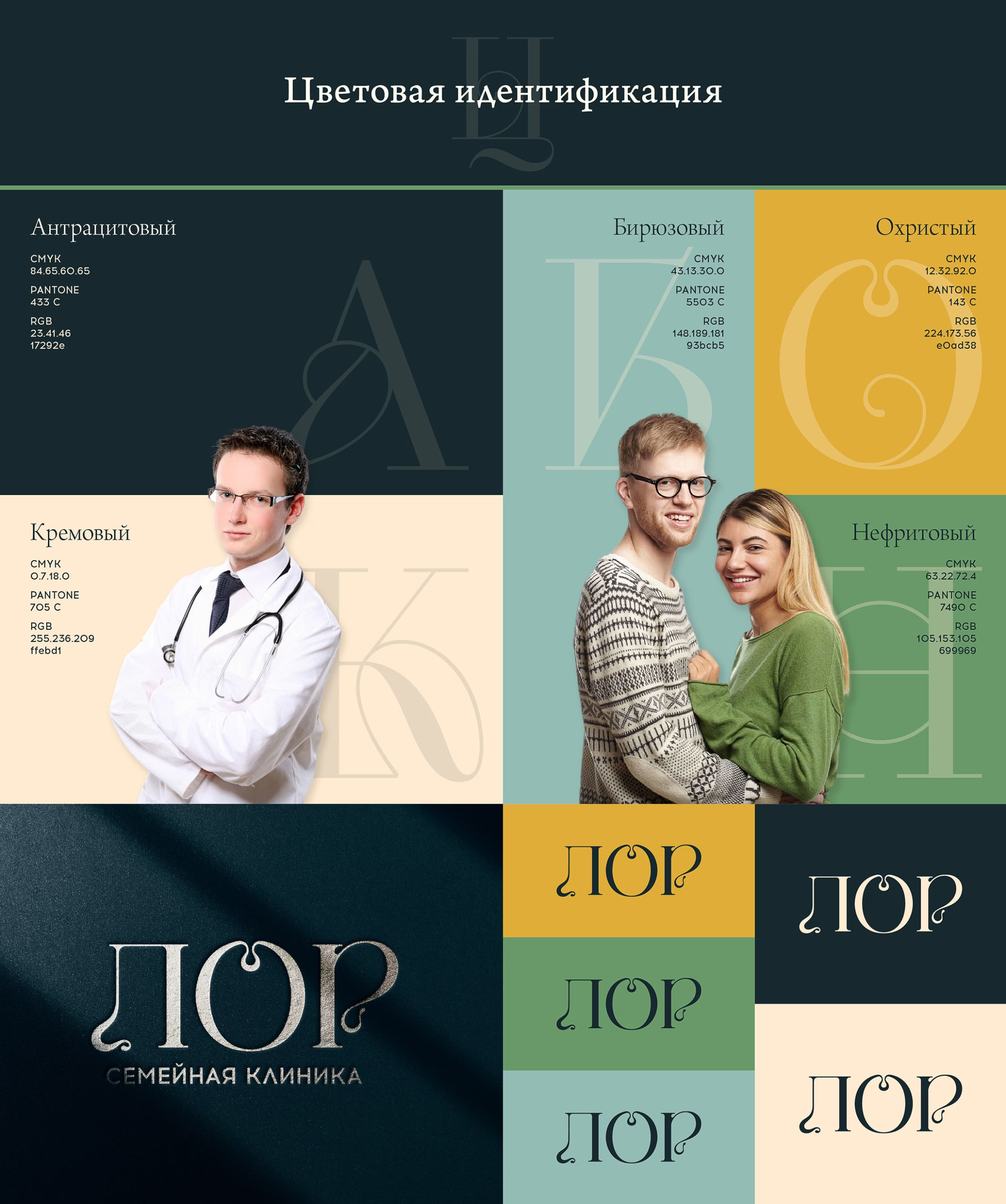
Color Identity
The brand identity utilizes subtly muted, complex colors to evoke a sense of traditional values and the high quality of services. The color scheme is divided into two categories to distinguish the family-oriented audience from the clinic’s expert level.
The clinic’s clients are affluent families who prioritize their health and the well-being of their loved ones. They value professionalism and the quality of services provided. These attributes are conveyed through two primary colors: cream and anthracite. The beige tone serves as the background in 65% of cases, while the anthracite color is used in the rest. This contrast highlights key information and essential brand elements. Accentuating information uses color blocks of jade, ochre, and turquoise.
Typography
To emphasize sophistication and the premium segment, the brand identity features typography based on a modified Kudry Weird Headline font. Modernist elements lend the identity a refined individuality, subtly hinting at biological fluidity.
In addition to the typographic pattern, the design incorporates drop caps, evoking tradition while maintaining a clean and concise appearance. Typography is also utilized in the children’s room design, creating an engaging and cozy atmosphere for young patients.
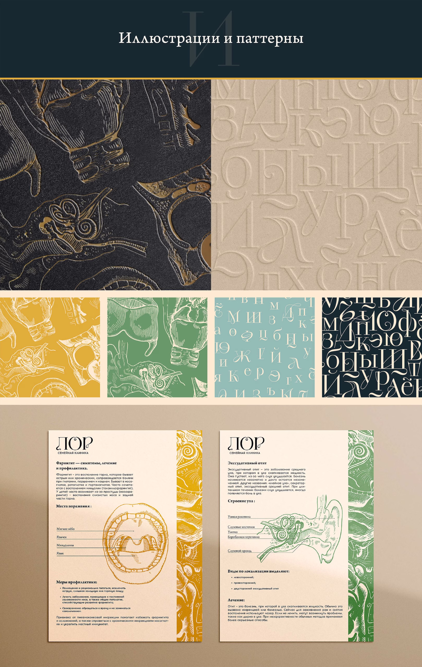
Illustrations and Patterns
To establish a unique graphic style, the brand incorporates linocut illustrations focused on medical themes. These illustrations add elegance and a sense of tradition, enhancing trust in the brand. Through visual storytelling, brand materials convey scientific-medical knowledge and promote proper care for hearing and respiratory organs.
The brand also features patterns inspired by linocut elements. These detailed textures spark genuine curiosity and draw attention.
Communication and Brand Materials
The brand identity prioritizes client communication. We developed standard business documentation as well as branded merchandise that fosters an atmosphere of warmth and family connection.
Navigation
For the Family ENT Clinic, we designed navigation signs and pictograms that maintain the stylistic continuity of the logo. The fluidity of the pictogram shapes is reminiscent of Henri Matisse’s frescoes in the Rosary Chapel. The large, contrasting forms of navigation signs harmoniously blend with the elegant typographic compositions within the interior.