Airport Navigation Design — Mirny Airport
Guided by the North. Inspired by Yakutia
Develop a navigation system for Mirny Airport
Task
Develop a navigation system for Mirny Airport that captures the northern soul and unique cultural flavor of Yakutia.
Solution
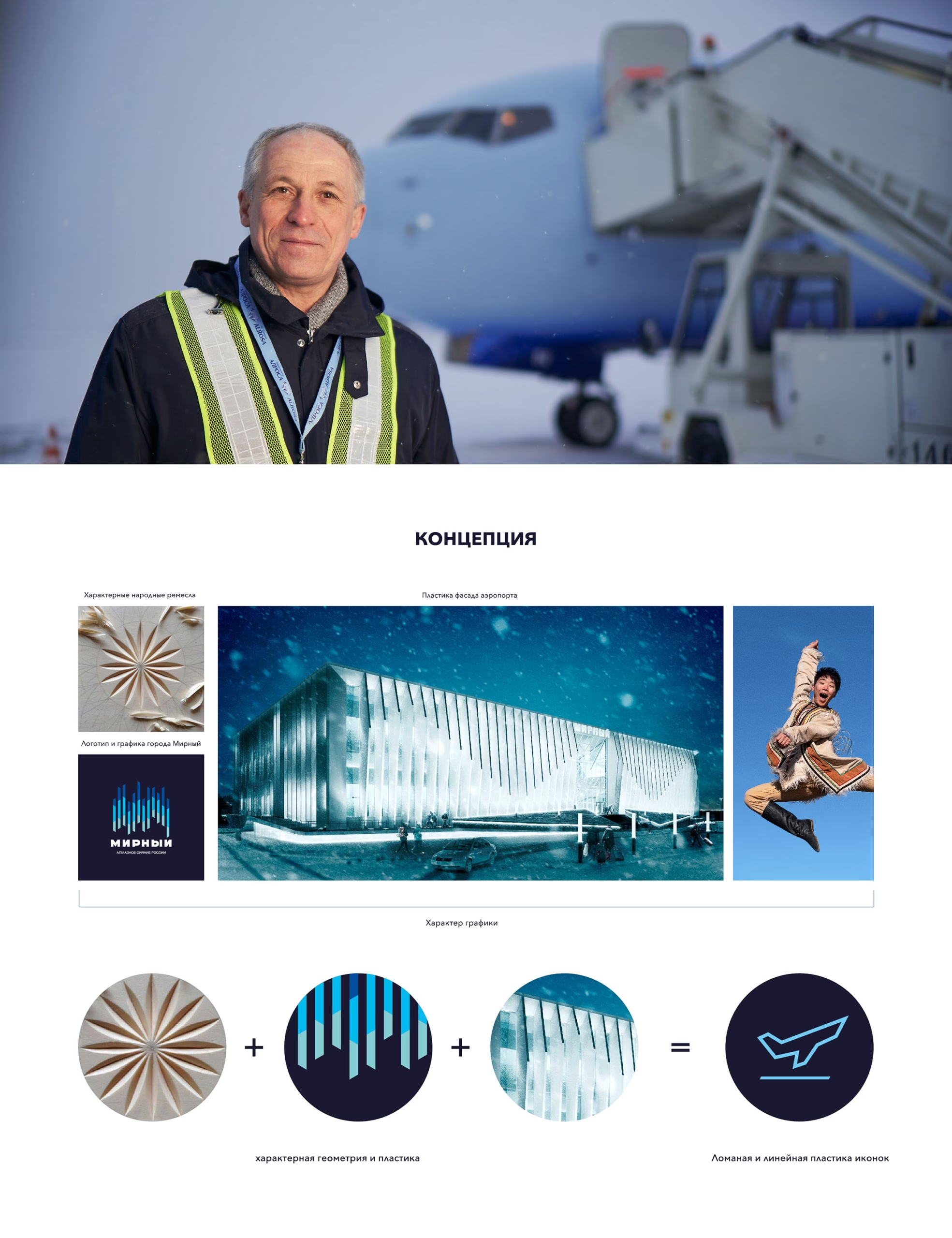
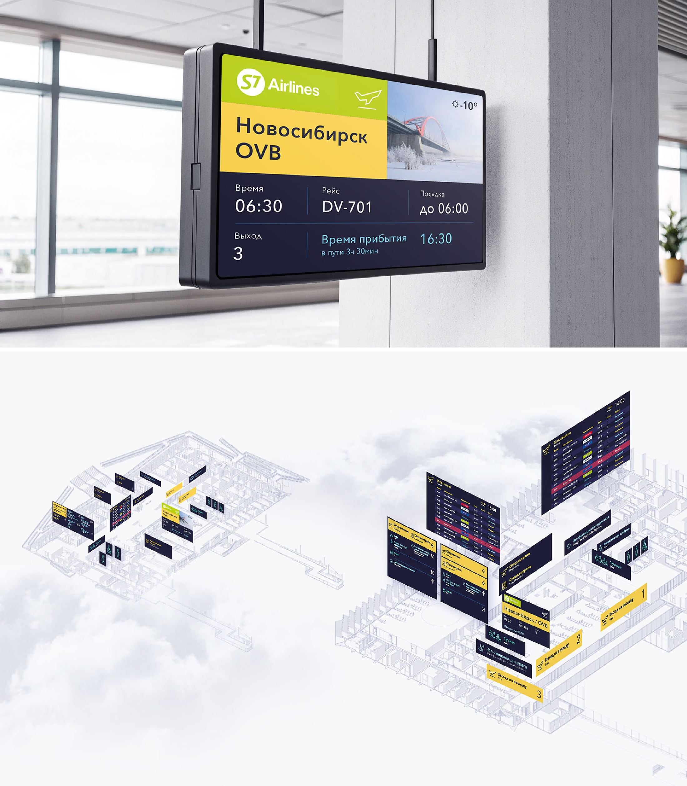
The design concept for Mirny Airport’s wayfinding system is built on two powerful pillars that define the Yakut region: rich cultural heritage and striking natural beauty.
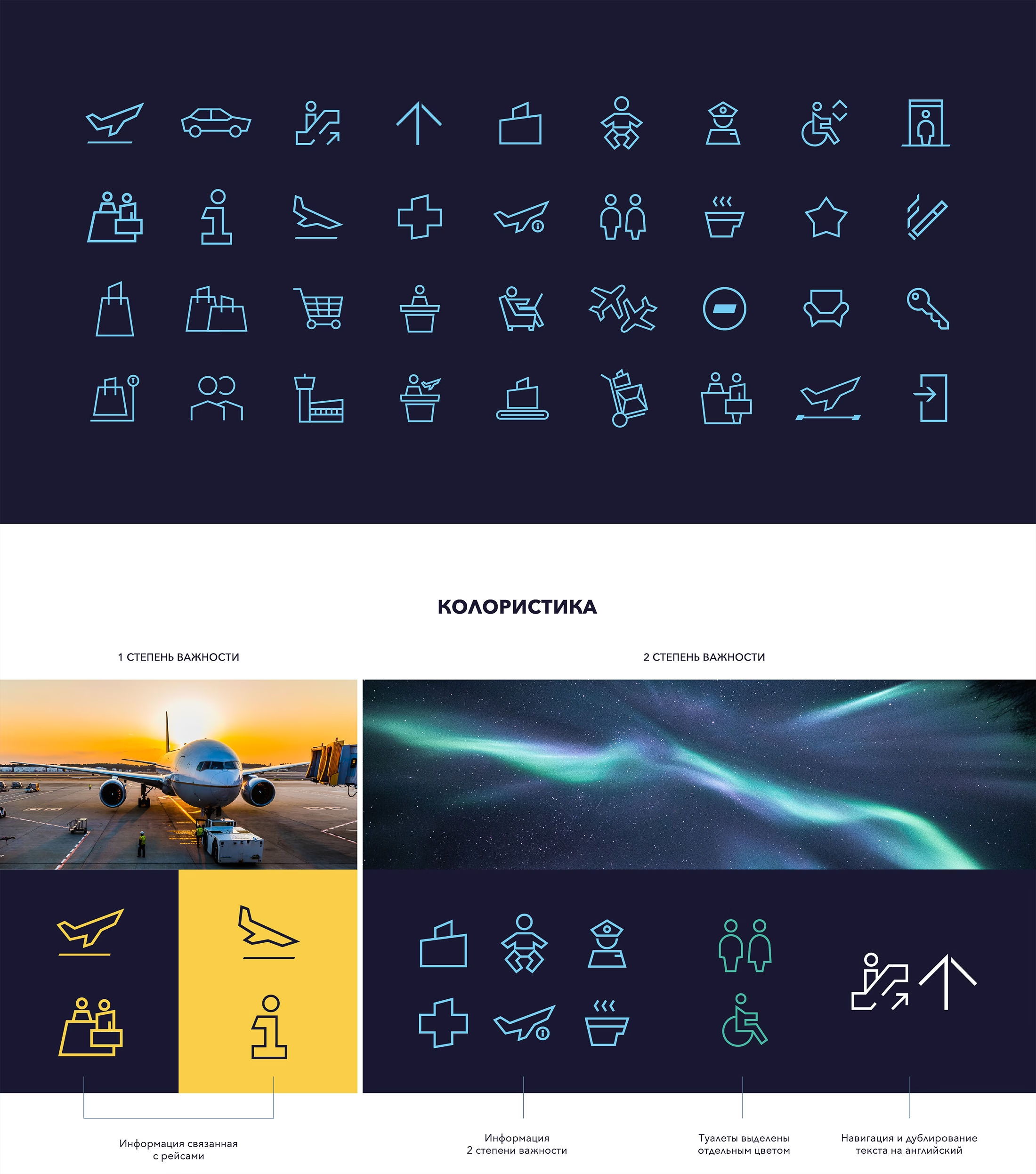
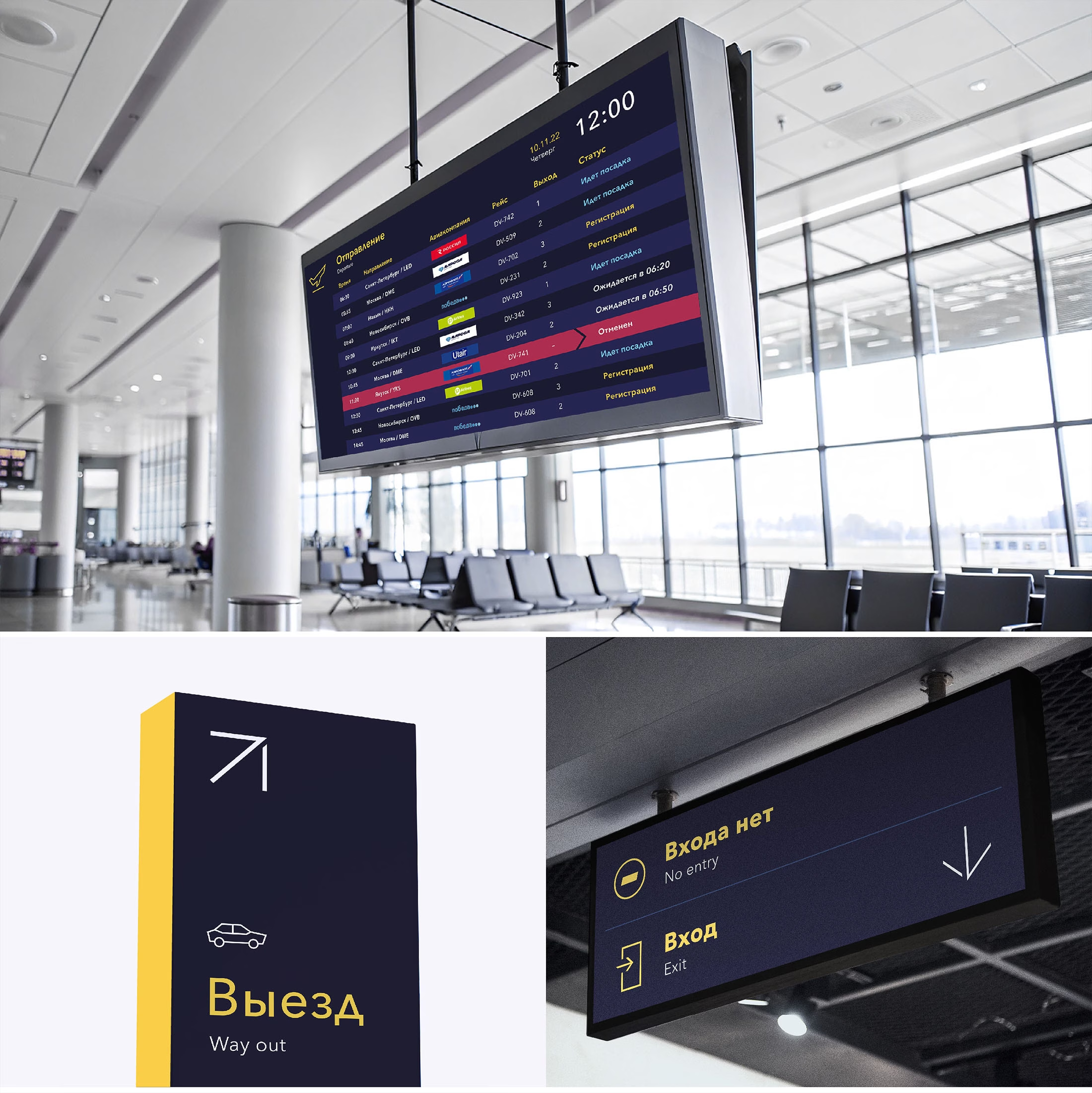
The visual style of the icons draws inspiration from traditional Yakut motifs — graceful, organic, deeply symbolic. The color palette reflects the mystical charm of the Arctic, where the land meets the sky in stunning contrasts.
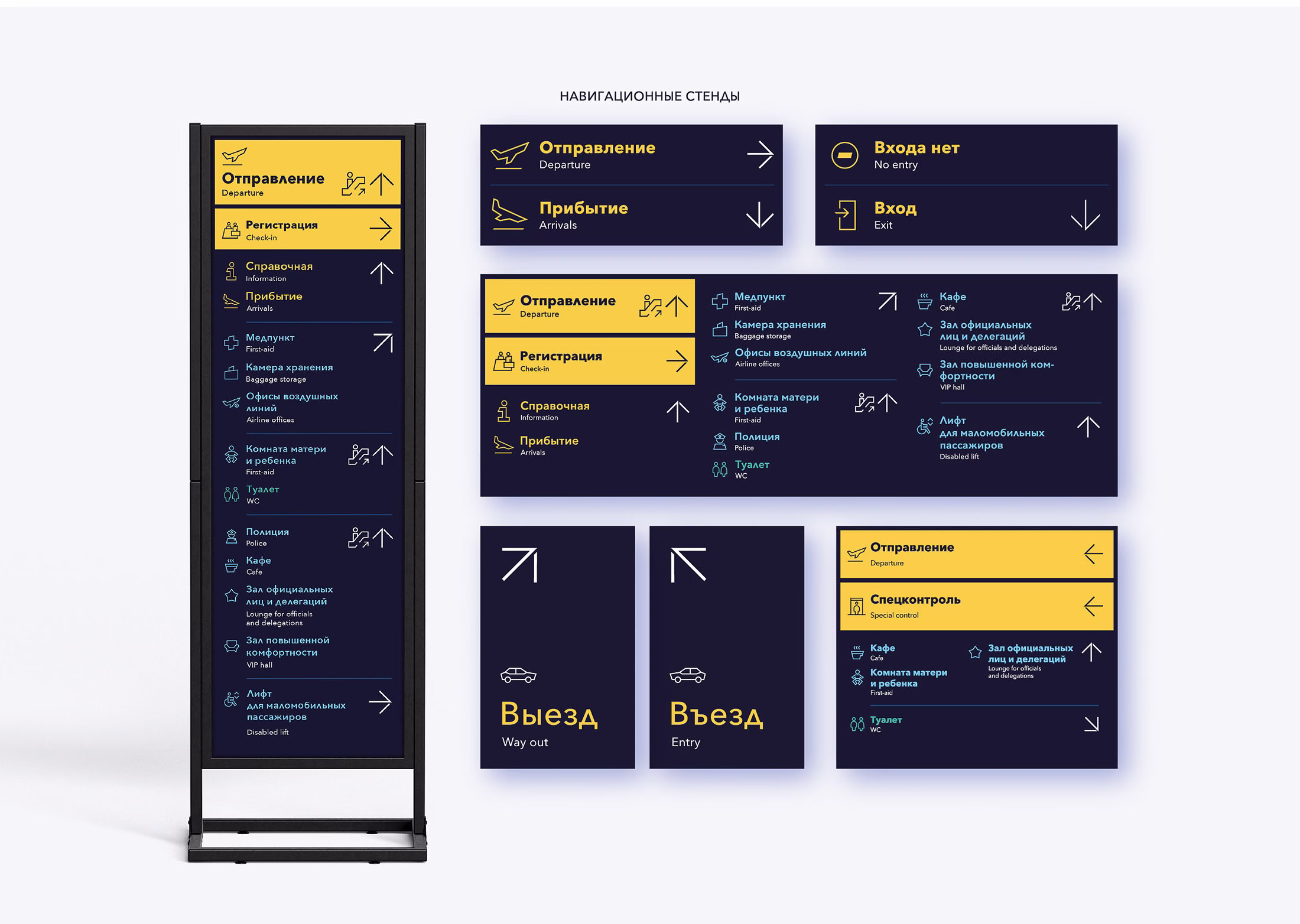
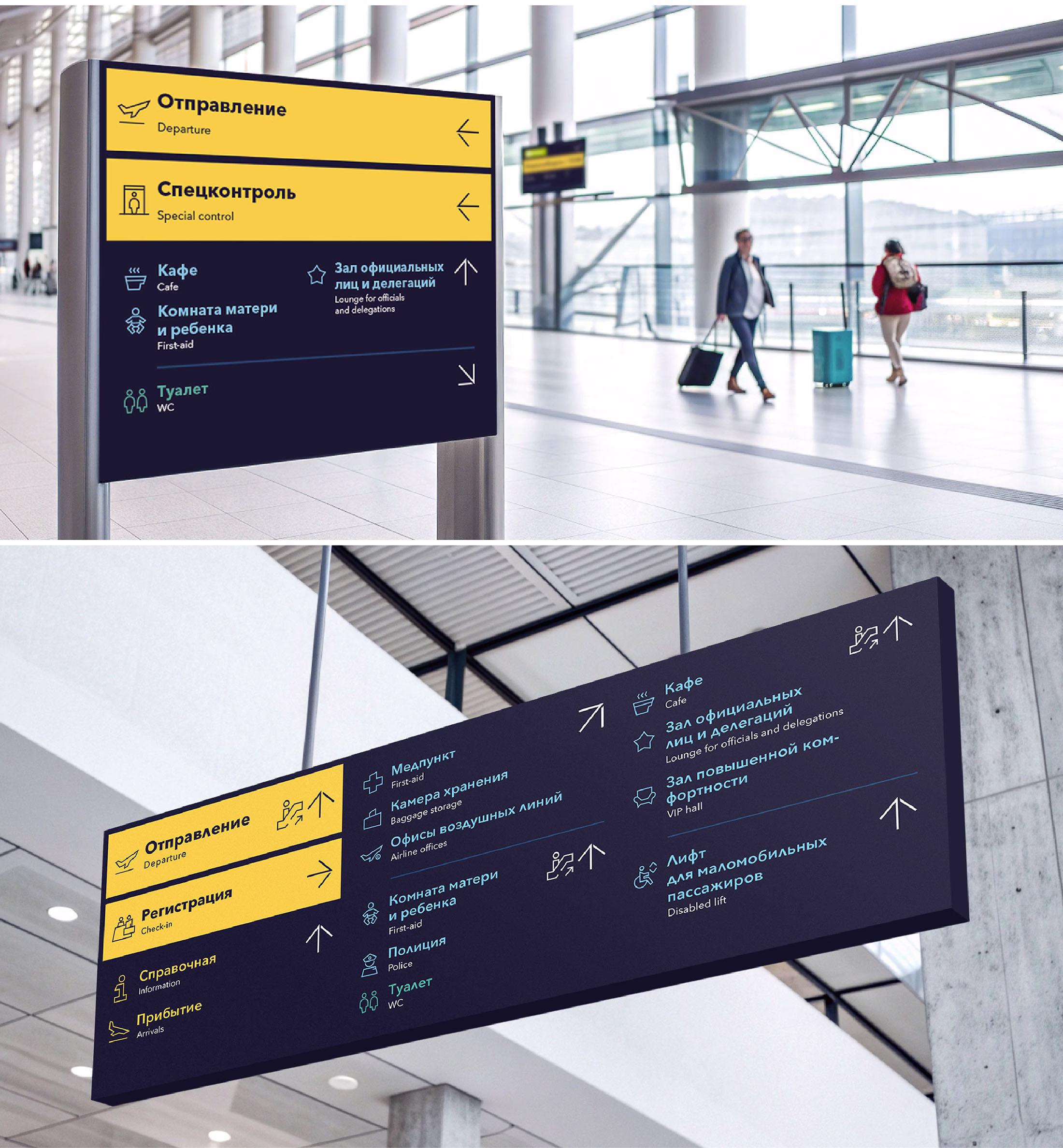
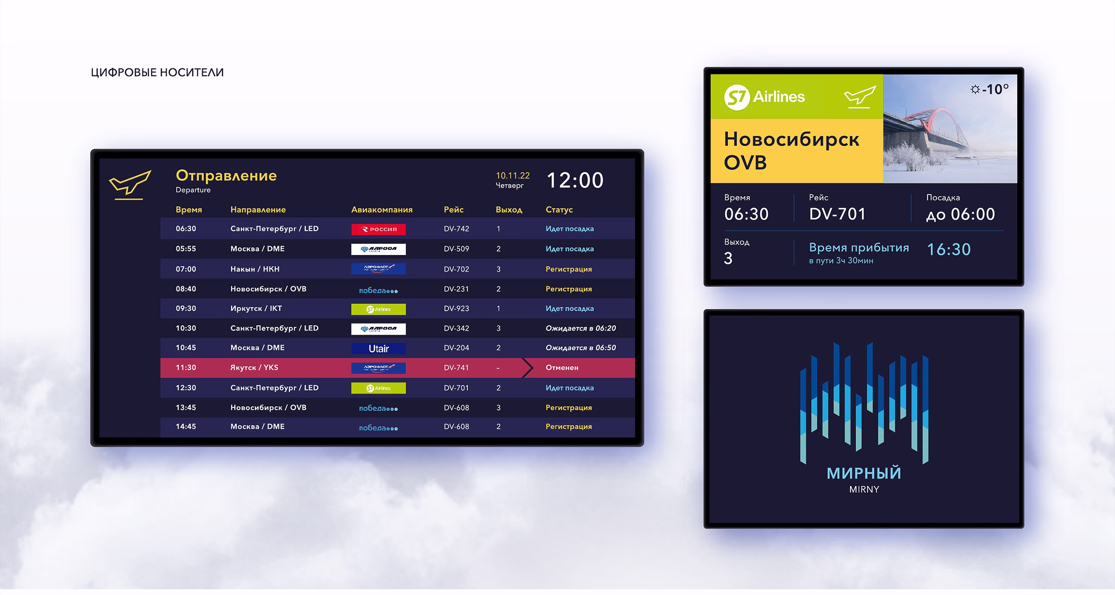
To make information clear and user-friendly, we introduced a two-tier color coding system: it distinguishes priority levels and draws immediate attention to essential flight-related data — departures, boarding, check-in.
The main highlight color is a radiant yellow, standing out clearly against a deep, twilight blue background. Complementary tones are drawn straight from nature — hues inspired by the Northern Lights, echoing the serene night skies and the brilliance of the polar sun.
This color logic ensures intuitive navigation while remaining aesthetically harmonious and visually striking.